How to stop zoom in on input focus on mobile devices
It has been almost a year since Safari (starting from iOS 10) disabled web developers' ability to prevent user zoom.
We normally take the viewport meta for granted.
<meta name="viewport" content="width=device-width, initial-scale=1.0, maximum-scale=1.0">This was a bulletproof solution to make our mobile responsive pages look the same in all mobile browsers while we ignored that many users struggled to read our hand-picked crafted fonts and our 4K display supported font size.
We had one more problem. When users tap in any form fields – the webpage zooms in automatically.
Problem
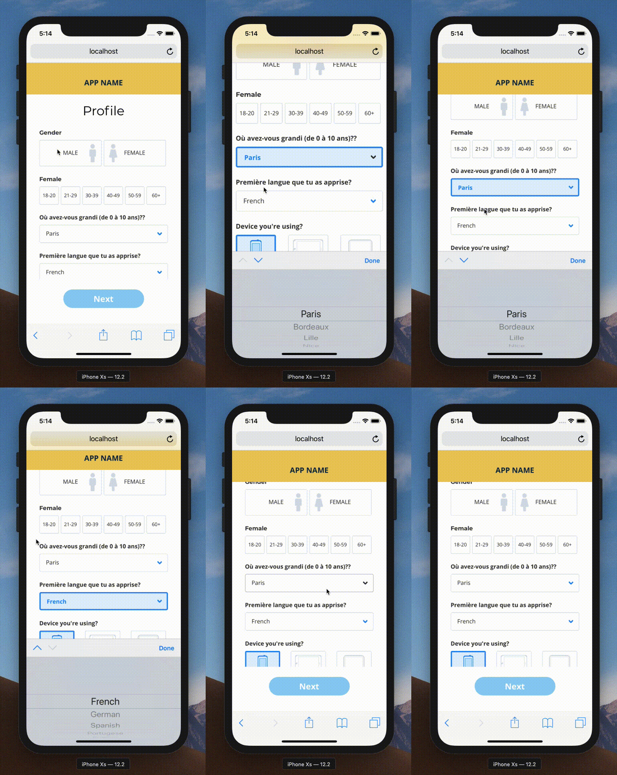
Now I know for the fact that – allowing this feature to stay unchanged is recommended – sometimes we do need to honour the client request and sometimes this zoom creates unwanted bugs in the UI.
For example – a date picker input – if zoomed in mobile – would most likely break the UI.
Continue reading below for the fix.
How To Fix
By default, all mobile browsers force the form element to work as it is. But when a developer sets the font size less than 16 pixels on any form element – mobile browsers intervene and force the UI or Page to zoom so that the texts are readable enough.
You guessed it, the solution.
Apply below
@media screen and (max-width: 767px) {
  input, select, textarea {
    font-size: 16px;
  }
}
Please note, you can set any value for the max-width property as per your style guide or UI design.
Same, the font-size: 16px might be overridden by other higher specificity rules, like other classes, selectors etc.
It’s a good idea to use !important just in this case. You are restraining the selector only for mobile, that means it won’t break your other UIs.